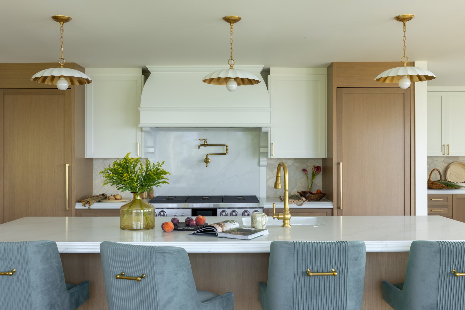
The Miller Residence in West Seattle is the largest gallery on this site — forty-one photographs, kitchen through laundry room. That's deliberate. A single hero shot tells you what a kitchen looks like; a full set tells you whether a house was designed as one thing or decorated room by room.
Here's what we were thinking as it came together.
The plan comes before the palette
The kitchen sits at the center of the main floor, open to dining and living, with the view held at the end of the sightline. Everything after that decision — where the island lands, how tall the pantry column runs, which wall gets the range — follows from the way the family actually moves through the floor: in the back door, drop everything, cook, eat, sit down.
We draw that circulation before we choose a single finish. It's the least glamorous part of the process and the part that decides whether the finished house feels effortless.
Two cabinet finishes, doing two different jobs
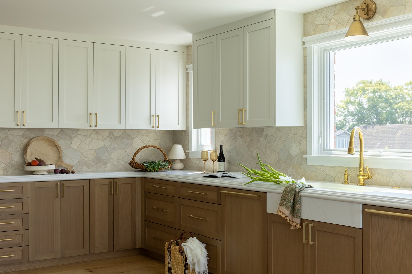
The perimeter uppers are painted light, which keeps the ceiling height and the windows doing the work. The base cabinets and the tall column are warm wood, which grounds the room and gives the island something to talk to.
A two-tone kitchen fails when the split is arbitrary. It works when each finish has an assignment — light where you want the room to recede, wood where you want weight.
One metal, carried all the way through
Brass runs everywhere here: the faucet and pot filler, the cabinet hardware, the pendants over the island, the sconces in the baths, the shower set, the mirror frames.
The rule we use on every project: pick one dominant metal and commit to it, then allow a single accent if a room genuinely needs one. Three metals chosen room by room is the fastest way to make a well-built house look unplanned.
A color that travels
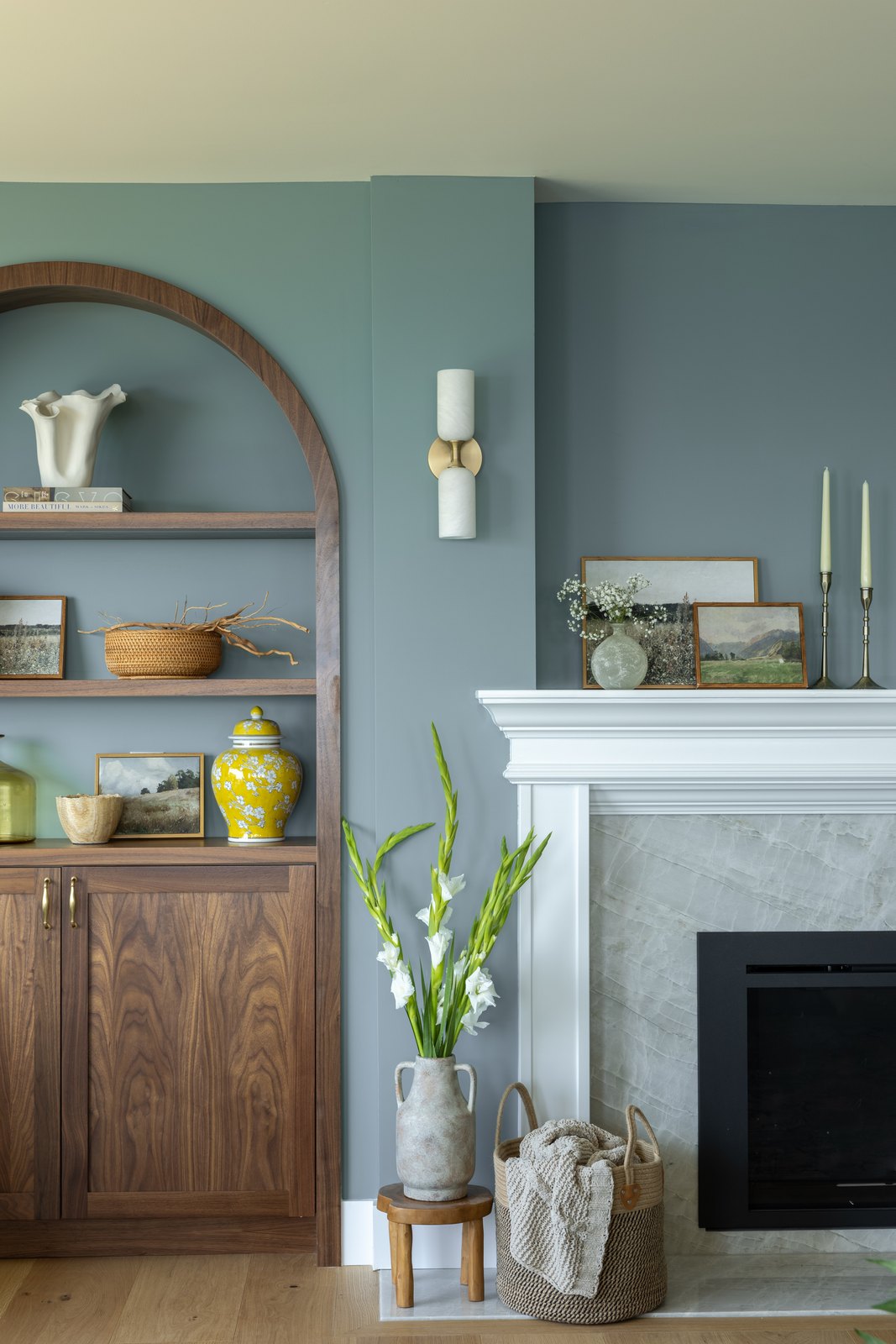
Blue-green shows up at the island stools, on the living room walls, in the secondary bath, and again on the laundry cabinetry. Nobody walking through reads it as a scheme — they just feel that the rooms belong to each other.
That's the whole point of a whole-home palette. It isn't about painting everything one color. It's about repeating two or three notes often enough that the house holds together.
Be quiet in some rooms so you can be loud in others
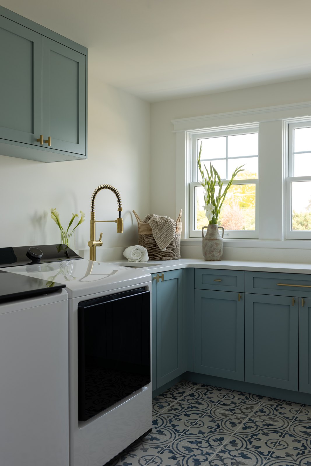
The kitchen backsplash is a calm stone. The guest shower is a lantern-shaped tile. The primary bath floor is a checkerboard. The laundry and mudroom floors are patterned.
Utility rooms are the best places in a house to take a risk. They're small, they're cheap to change, and they're where a little personality goes the furthest.
Why an architect ends up in your kitchen
Cabinet elevations, lighting layouts, and tile layouts all get drawn before anything is ordered. Not because drawings are fun, but because that's when a misaligned sconce or a pendant that lands three inches off the island centerline is still free to fix.
That's the difference between a designer's eye and a set of construction documents — we bring both, and the second one is what keeps the first one from getting expensive on site.
See the whole house
The full set is in Select Work. Photography by Emily Keeney.
If you're planning something similar — a whole-home remodel where the kitchen, baths, and the rooms in between all have to add up — tell us about it.